Tales from design—Turning user data into insights
July 8th, 2015Comments
“This just isn’t right,” Bryan murmured as he peered over his desk staring at the H&H Tattoo website on his iMac.
Our guts told us the H&H website could perform better and that the content wasn’t exactly what people wanted.
It just didn’t feel right.
Having worked with H&H for years and spending hours with them in their shop, we had a strong understanding of what their customers valued—the self expression that made them feel alive. But it’s hard to connect an emotion to the reason we felt there was a lot of room to improve the current site. We needed insights into the nuances of user behavior.
So, fresh off of a great experience with Hotjar and talking with Hotjar founder, David Darmanin, we knew the tool (along with Google Analytics) would help us collect the data we needed.
“We’ll have the data to backup your ideas soon, Bryan,” I said.
I didn’t want to wait. Bryan was more anxious than me. But what good is a “gut feeling” in the absence of real user insights.
We had our answers soon enough.
We always had an eye on improving the websites and web apps we produce. After doing several “upgrades” for clients, we’ve formalized our improvement process. And now our focus was on improving the Hart and Huntington Tattoo website. We couldn’t wait to start.
Maybe it was because H&H Tattoo is part of a such a vibrant community. Tattoos are not just popular—it’s a multibillion dollar a year business. And Chris Turck, owner of H&H Tattoo, located in Universal Citywalk, is ready to be the leading brand in this sector.
I turned toward Bryan. “So, what do we got?”
“I’ve pulled together data from Google Analytics and Hotjar, which gave me heatmaps, user session recordings, and poll responses. Here’s what I found.”
Bryan slid over the printout of colorful charts, heat maps, and numbers he assembled.

Many users clicked the first artist name in the menu as the way they began their discovery.
“There’s more,” Bryan said.
“Many users are leaving feedback from the polls in Hotjar. Take a look at this wordcloud of the responses from users that converted on the site.”
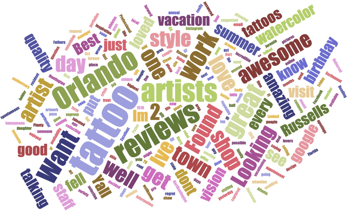
I looked at the words jumping off the screen. It was clear H&H had built a name for themselves and people were seeking them out. And people trusted the reviews of others—a lot.
“Here. You’ve gotta see this, too.” Bryan, pointed to his monitor. The screen flickered, then displayed a user session recording in Hotjar.
“See how they tried clicking on the tattoos page multiple times? Seems like they were looking for something specifically, but weren’t finding it”
It was clear there was slivers of confusion amidst huge caverns of opportunities to give people what they wanted.
“So, what do you recommend we do?” I asked.
Bryan, paused, then smiled. I caught the gleam of excitement in his eye as he said, “Let’s go over the opportunities I see together.”
“Phew! That’s a big undertaking.” I said. “We need to run a design studio to map the concepts to these theories. And I need to pitch this to Chris at H&H.”
“Think he’ll go for it?” Bryan asked?
“He’d be crazy not to!” I said.
I invited Chris over that week. With the data on screen, I explained our ideas. He was immediately interested. I told him I will followup with a plan to move forward.
I sent the plan. Then waited. I waited more. I was getting nervous.
Then finally, Chris reached out to talk more on the phone. He explained he had two major concerns.
”I'm concerned the build cost will be out of my budget and I don’t want to pay you to learn what you should build. Don’t you guys know that by now?”
I took a deep breath.
”In the design studio, you won’t be paying for us to learn how to build websites. We’re already experts. What the exploration is for is to allow us to design what we believe to be the best answer to the issues we want to improve.”
"Otherwise, we’d just be quessing at the cost of the build since the solution hasn't been designed yet,” I said.
Design is one part observation, and one part imagination. If we just guessed at solutions without exploring creative ways to solve them, we’d be skipping an important part of the process. I’m a huge advocate of not taking shortcuts in design.
Chris agreed. ”Let’s do it!”
We were all set to move forward.
///
In part two of this story, Bryan creates designs to test his hypotheses and Ian, Chris, and Glenn lay down the programming to make it all work.